
READING & WRITING:
Chapter 10 of Animated Storytelling reminds me of a mom talking to her child before they leaves on a trip. Did you pack your toothbrush? Socks? Underwear? A jacket? Get your oil changed? Don’t forget to thank your host, etc. etc. It’s a chapter full of repeat reminders, tips, and encouragement.
The first word of encouragement is to start projects that are a little simpler to animate in order to gain confidence. I am taking this to heart by continuing to animate more gifs. In a similar vein, she also recommends breaking up tough scenes into smaller pieces so that projects do not overwhelm you. Blazer also reminds you of the practicality of production calendar, starting backwards, checking tech, and brutal editing.
Special attention is giving to including anticipation and follow-through, whether a character or text. This is something that was also hammered in After Effects Kickstart class as well, which makes it even more notable. Consideration should be given to the direction movement, get out of the center and vary the timing of shot lengths. For example, utilizing close-up shots, but not staying too long. All of this is so important you may want to revisit your scenes if they aren’t working. Be flexible. Don’t get so locked in that you don’t pivot when you need to.
Like a mom trying to impart all her wisdom, Blazer finishes with reminders on working with sound, as animation is a dance back and forth between sound and image.
RESEARCH TO INFORM:
Love the clean streamlined look of this UI design. Especially on the animated survey question, How did you hear about us? Simple clicks: Instagram, Linked In, or Web.
Beautifully animated UI design for a clothing shop. I love the clean look when the images are small and how they increase in size when the user interacts with the site.
Lots of use of unexpected color for a bank. Along with animated scrolling options for locating a bank on maps and checking your balance. The animations open you up to the idea that banking can be, Fun!
Of course, I adore the hand-drawn elements to this UI. The user interacts with the content by scrolling down the main page, to read more about DBT therapy. The simple navigation buttons allow the user to readily identify the next step.
Fun shapes and colors are the hallmark of this UI design. However, I am partial to the animated logo, but I also like the animated product interaction, where a client can click an arrow to send an instant message to the company.
CREATE:
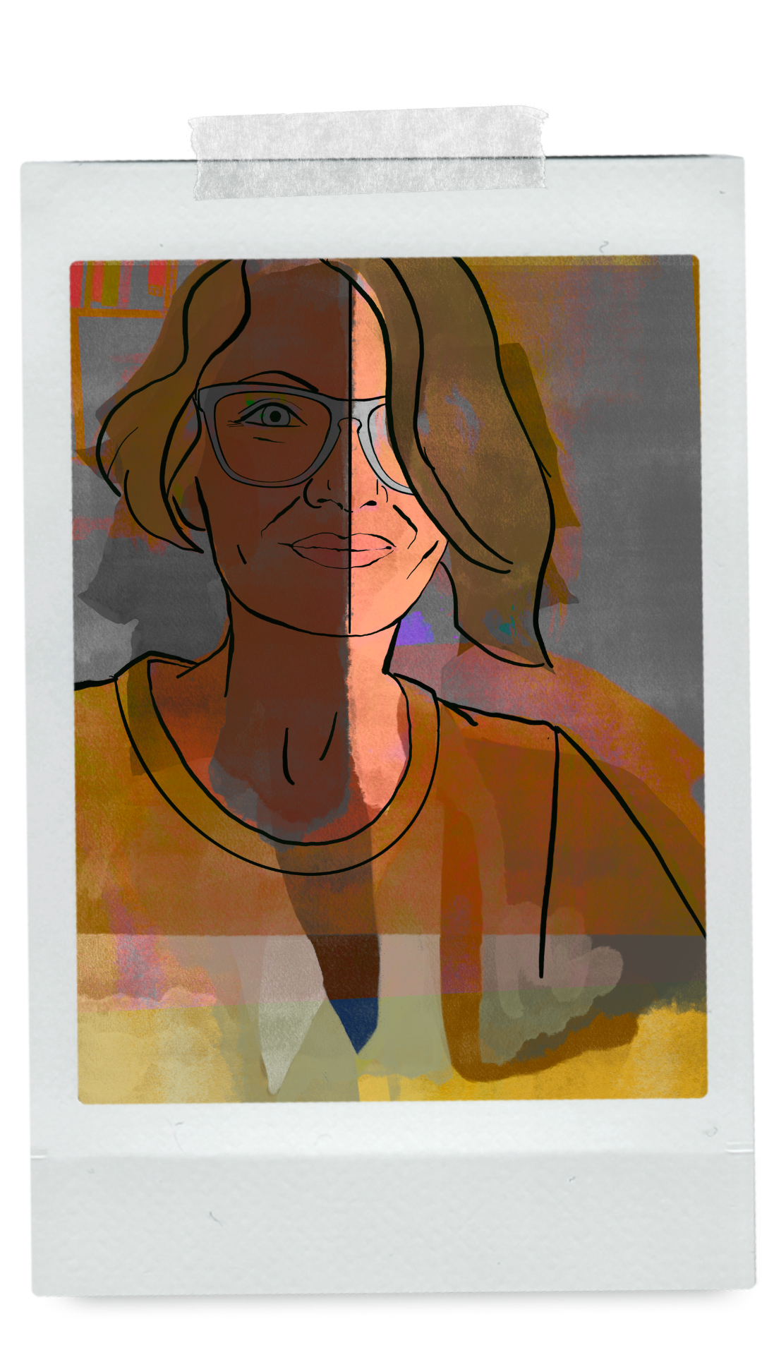
Once again I love that I had the opportunity to try something new, although I have wireframed for ID, I have never created an animated UI. After trekking through loads of UI design, I settled on a scrolling UI animation and found a YOUTUBE tutorial to help get me started. This was my first time using an alpha inverted matte in AE, I used it to block the scrolling at the top of the screen. This made me realize again the power of track mattes and that it would be a good idea to revisit my AE class on that topic. The matte stayed in place at the top of the screen and was a major time saver. the video itself ends a bit abruptly, but only because it was created to loop back to the starting point.
Here are both the MP3 version with audio.

And the animated .gif (no audio).

Leave a Reply