
There has been no end to my complaining about WordPress (sorry WP). However, according to multiple online sources WordPress powers 43% of all websites and 97% of all blogs. Which means, understanding how to design a better WordPress site is valuable tool for a digital designer. So enough whining, time to get to work.
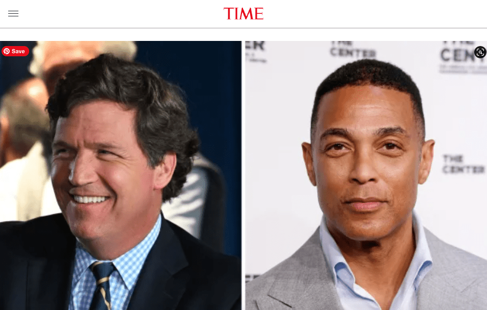
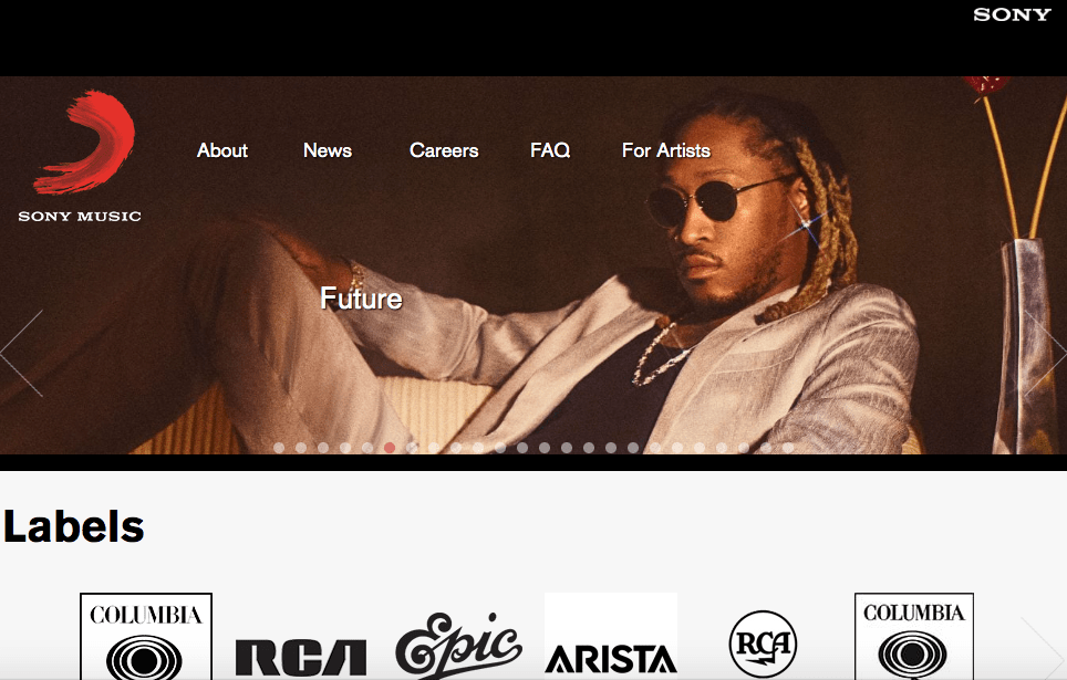
Before attempting to sketch ideas for my homepage, I started with hours of research, combing through various WordPress websites to observe the design possibilities using the WordPress platform. It was interesting to discover big names like, Vogue Times Magazine, and Sony Music were all hosted by WordPress. However, after perusing many sites it didn’t take long to recognize that most website design centers around imagery, imagery that ranged from a full size image, to a half page, split page with two images, multiple images ranging from 3-8, squares, rectangles, or simply a single thin title image.
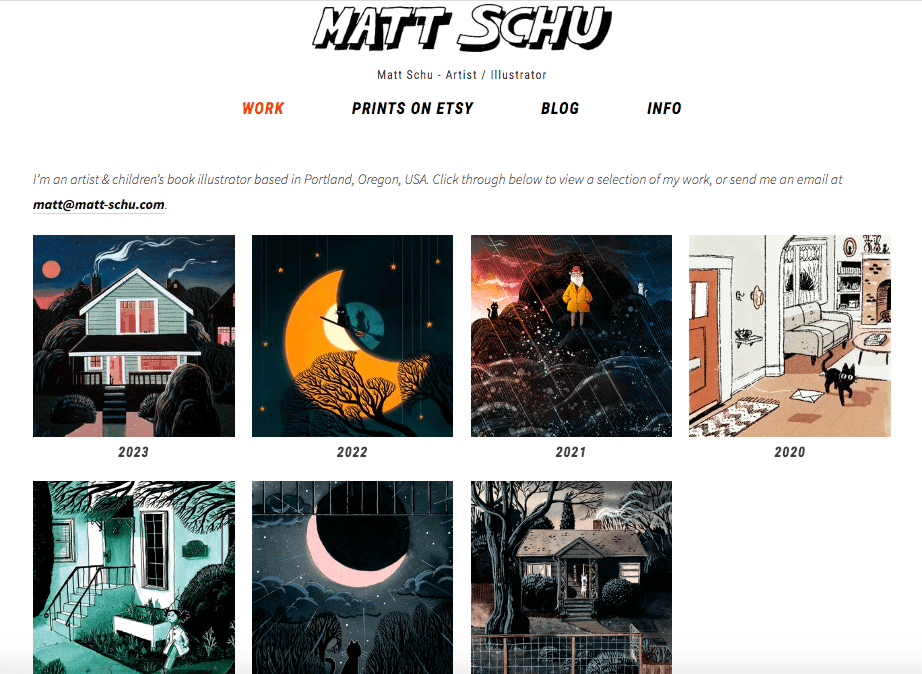
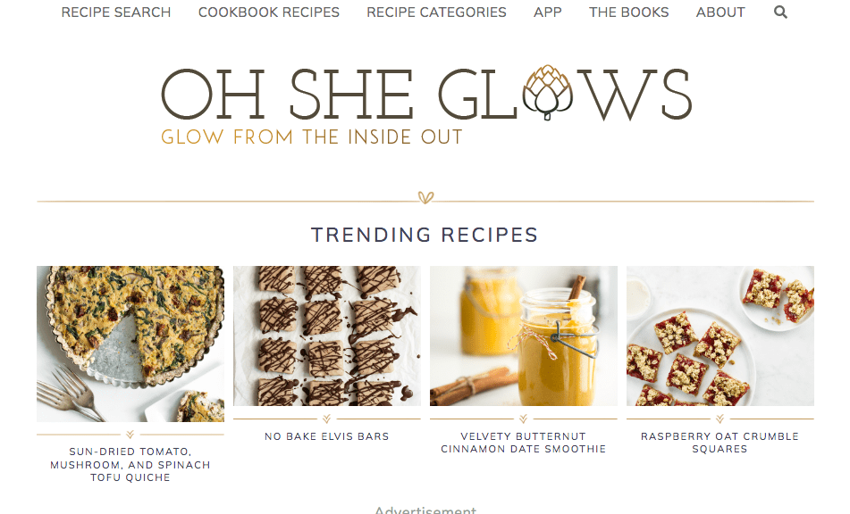
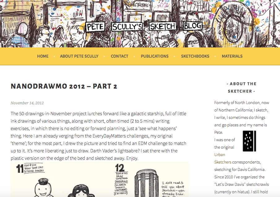
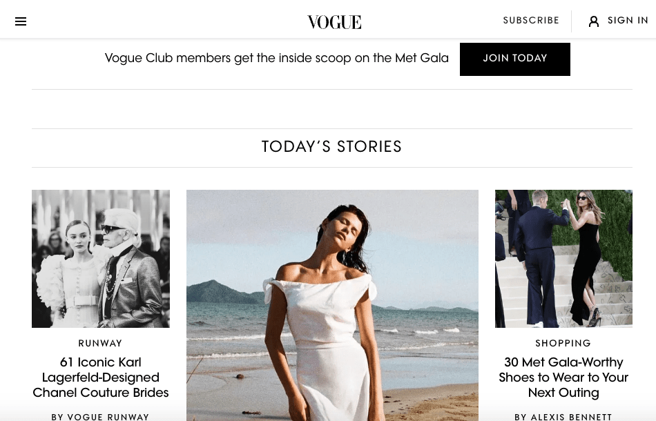
The website imagery is focused on an individual or several, and often the intent is to encourage interaction from the reader through a subscription or to make purchase. Some images are scrolling and based on a current events, while others are static and hold archived portfolio work. A few pages emphasized a logo, but most are simply a font, and fonts can readily categorize what is being presented.
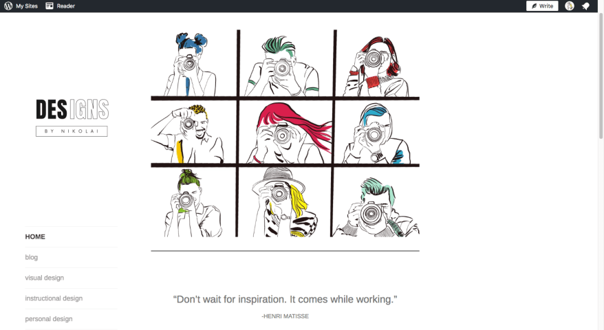
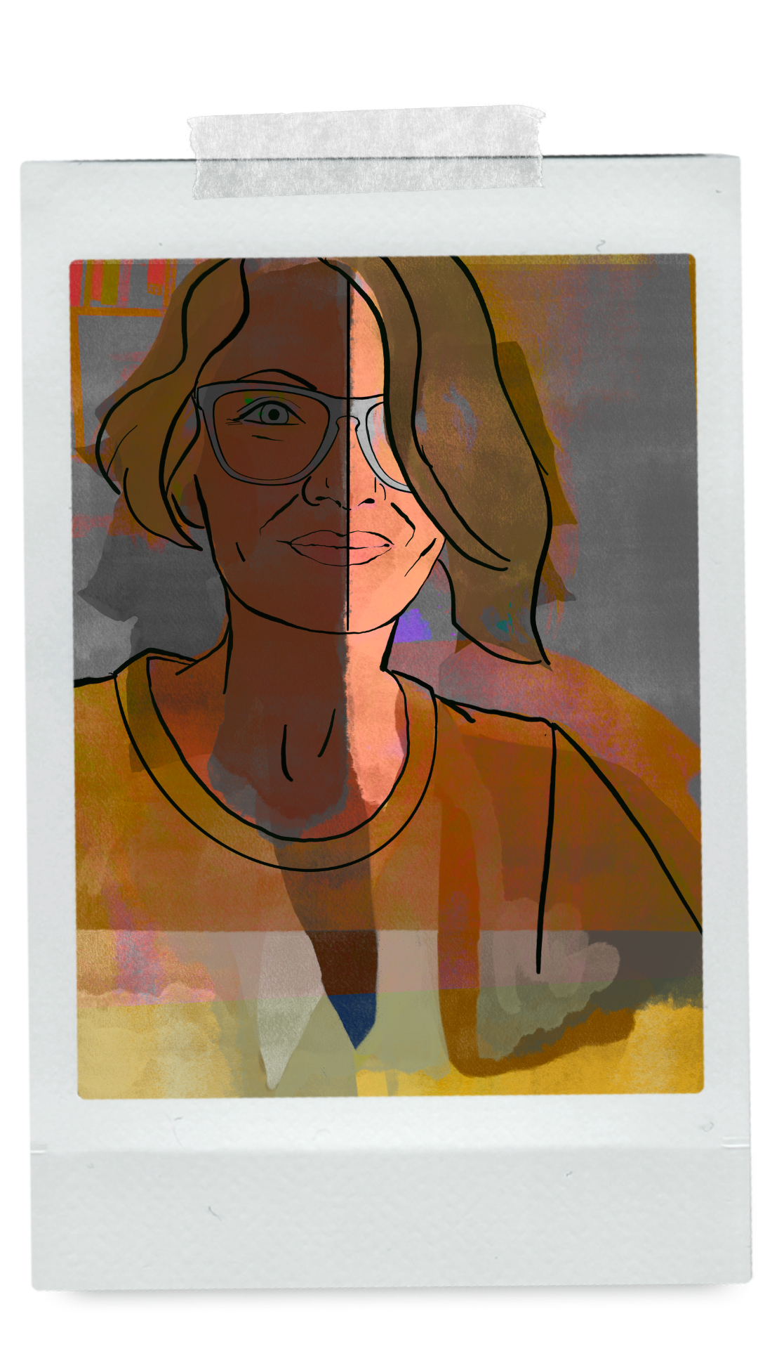
My current site had a single image, which although a procreate illustration did not represent the width of my current work. It also had a somewhat sad Canva logo, oversized thumbnail images for each blog post, and a wonky unintuitive side bar navigation menu.
I began sketching some very simple wireframe ideas based off of websites that I liked. However, after several iterations of a homepage with 1-3 images I realize that it wasn’t capturing the entire story, and most likely a large reason why I was dissatisfied with my current design.
CLARIFY YOUR AIMS:
Designs by Nikolai was not only created as a requirement for Quinnipiac’s Masters program, but also as a way to build a digital portfolio for a future online or in-person teaching assignment, combining instructional design with digital art.
Therefore, the website should be a place where educational discovery is valued, specifically in the area of Digital Art, Web, & Graphic Design. Topics should include:
-Color Theory
-Design Theory
-Design Print Projects
-Illustration
-Typography
-Photography
-Photo Retouching/Manipulation
-2D Animation
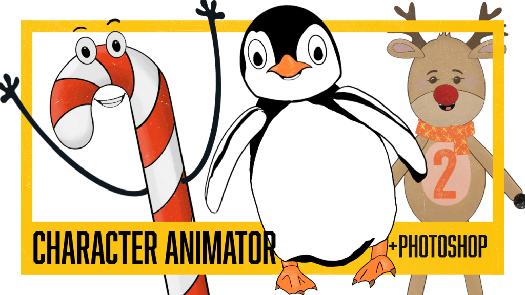
-Procreate, PS, Illustrator, ID, & After Effects
As well as, show understanding of digital design curriculum, an ability to communicate ideas effectively (instructional design), engage in personal growth, and overall creativity, as well as, inspire future digital artist.
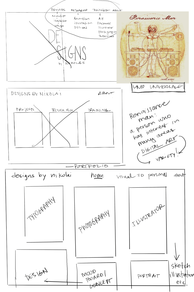
The biggest challenge was how to create a landing page that highlighted all of the above design content, without looking like a messy thrift store?
The idea of Uomo Universale, or the idea of a person who seeks to develop skills in several areas of knowledge, in this case digital art. Clearly, I’m not a Renaissance man, nor am I exceptionally gifted in areas of music, art, or language.
However, like Danny Gregory put it, “Creative people don’t have to fit into uncreative pigeonholes. We can make anything if we have the courage and the time to figure it out.”
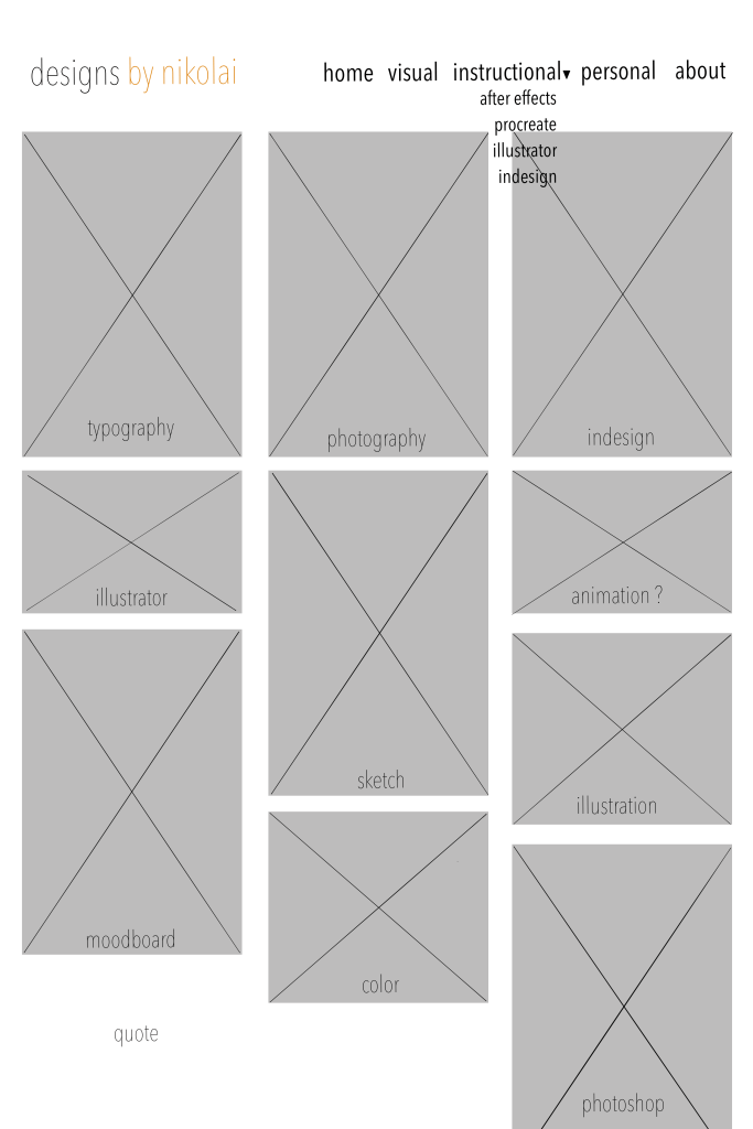
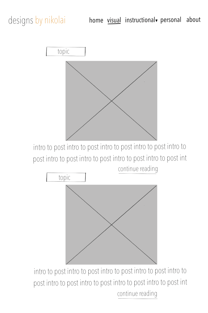
Therefore, the homepage could be made more cohesive by a portfolio style display of images representing each topic of proficiency. While originally I thought to change menu items, the new design gave clarity to topics, and showed the need for a dropdown menu under instructional design (and perhaps in the future, visual design as well), following Caldwell’s recommendation to keep menu items to a minimum (176).
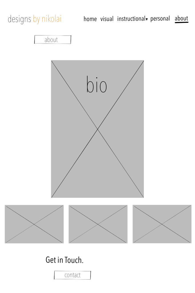
In addition, I needed to adjust the feature image size, horizontal logo, fONT, and vertical portfolio images. However, while I feel confident in the layout fits the goal, it is obvious that I have work to do in order to continue to build my portfolio. Each image needs to represent the best in my portfolio or work in that particular category, a difficult challenge considering in Illustrator I have 3 total pieces of work to choose from.
While it is not exactly where I want it to be, already the website is miles from where it was from and reflects more accurately what I would like to achieve. Not to mention, I have a definite focus when creating new work and to enhance areas that need more work. An exciting challenge !
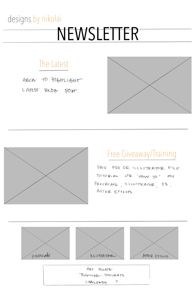
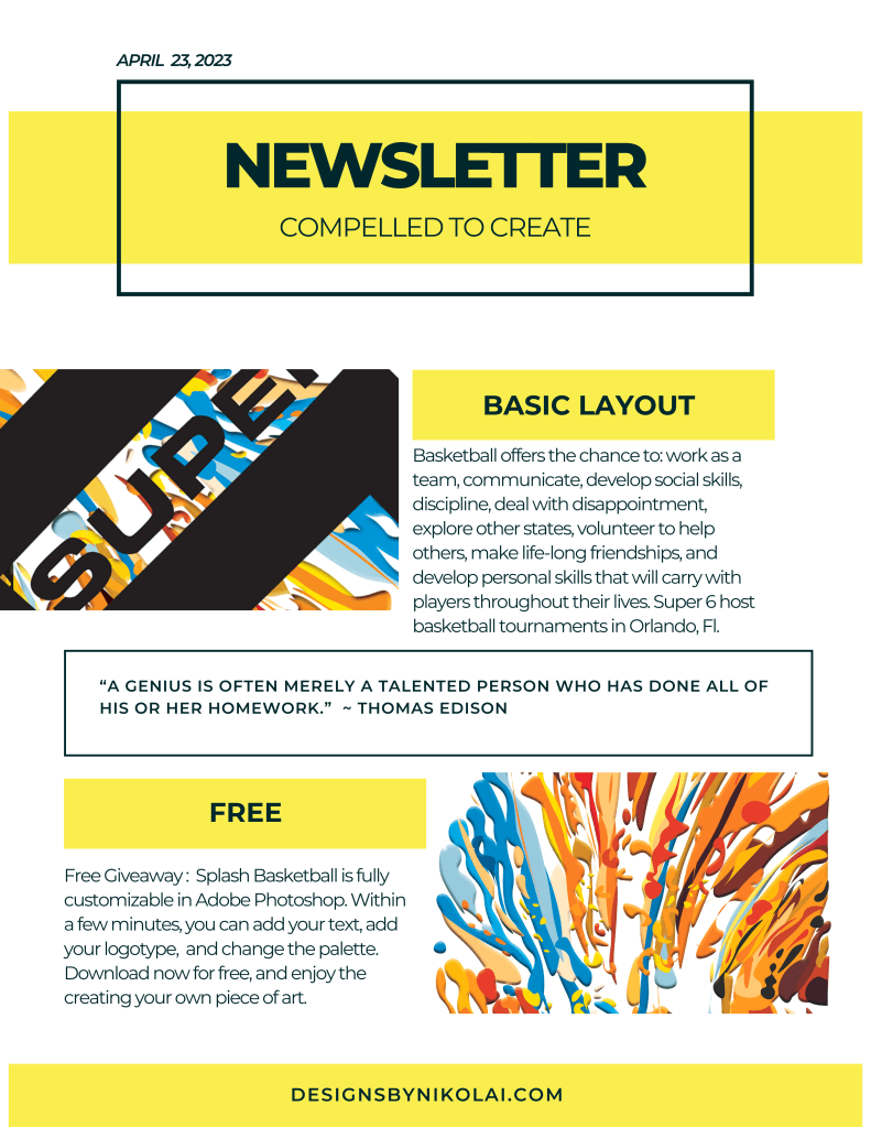
If in the future I were to send a newsletter, I knew that I would want to start with a simple update on the latest blog post, but I would also like to include a freebie, a tutorial in one of the programs, a book or class review would be at interest to the reader. Originally I thought to add a section where each program is highlighted, procreate, after effects, and illustrator. However, I took them off and went back to the original idea, as I like the simplicity of the two items, and perhaps as I add more work to the portfolio adding the additional images would work.


Leave a Reply