
Westlook Resort Living in Reno, Nevada is a quiet apartment complex located on a hillside with beautiful mountain views, but also boast a short five minute commute to downtown Reno.
The company website summarizes Westlook Resort Living experience in the slogan, “City life, mountain moments.” Therefore, when creating a brochure, it is important that it reflect both: the bustling city of Reno, as well as, the less traveled road.
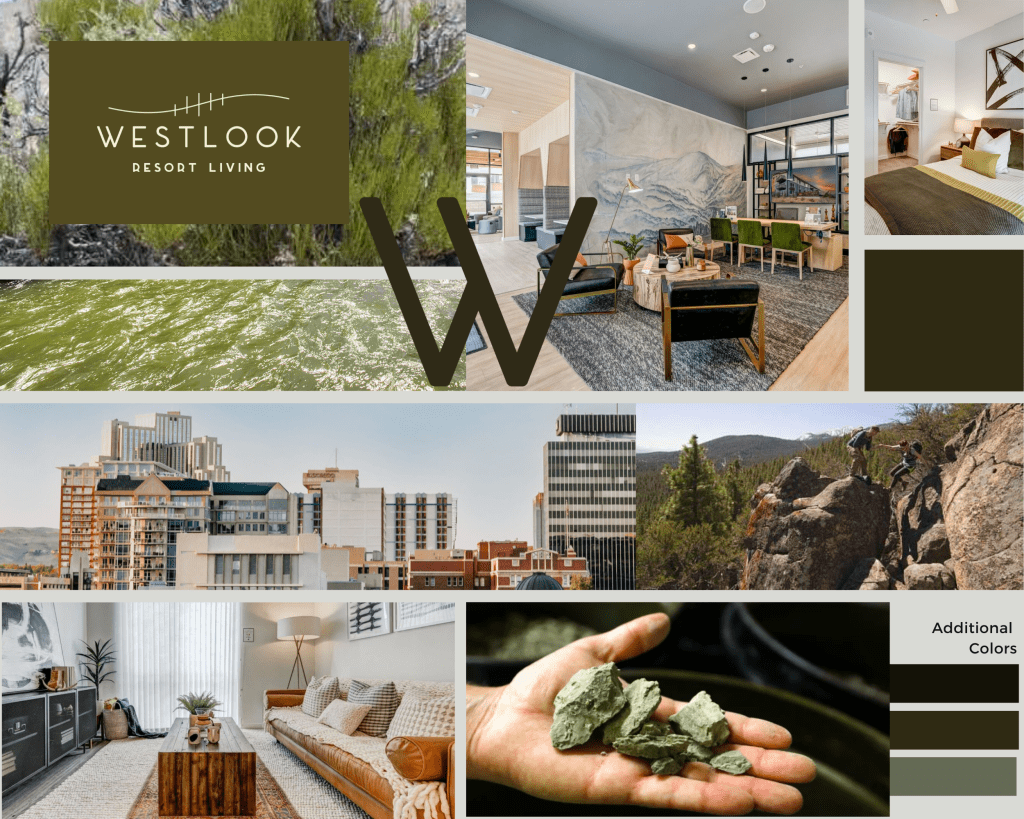
Concept ONE: rich, deep, nature, downtown, bustling
Mood board inspired by the rich greens, reflected in the nearby Truckee River. The river is located across the street from the complex, and it’s banks are surrounded by natural brush boasting several shades of green.
Within walking distance, or a short drive, a resident can experience one of the many beautiful vistas offered in Reno, or get more tactile and scavenge for natural rocks full of deep greens hues.

Concept TWO: warm, comforting, earthy, vibrant, alive
Moodboard inspired by Reno at sunset, or hit any road and be welcomed by warm browns along the roadside.
The Westlook sign was crafted out of rustic brown, similar to local artwork created Reno-Sparks Indian Colony. And Wild Market Collective, which supports local Reno artist, and artisans.
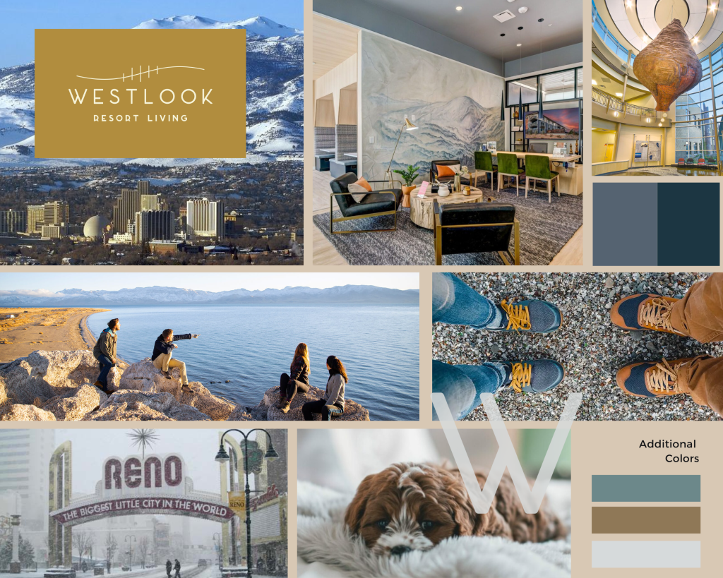
Concept THREE: light, interconnected, view, warm/cool
Moodboard inspired by warm/cool paradox. You can’t live in Reno without experiencing the bright winter light and summer lakes.
Not to mention, you can be in the city or on the trail in a matter of minutes. A local sculpture of woven bark & pine resin against the blue sky of Reno also reflects this dual nature looking to, “Paiute, Shoshone and Washoe tribes’ rich culture for inspiration.”


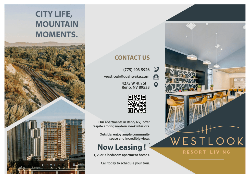


Concept three was chosen for the brochure design, the blend of warm & cool colors highlight the wide range of experiences that come from living at Westlook, Reno. In addition, the combination of images from the complex represent the modern luxury of the apartment, with warm colors and textile additions, blending urban/modern with a warm homey feel. The train tracks across the street, invoke a spirit of exploration that is readily available to residents who want to explore outside the city. However, downtown Reno, is a reminder that the commute is just a few short minutes away. The brochure strives to encapsulate the blend of convenience, with the experience of getting away from it all. Altogether, the combination of images attempts to create an overall mood of, “a breath of fresh air.”
Product Labels:
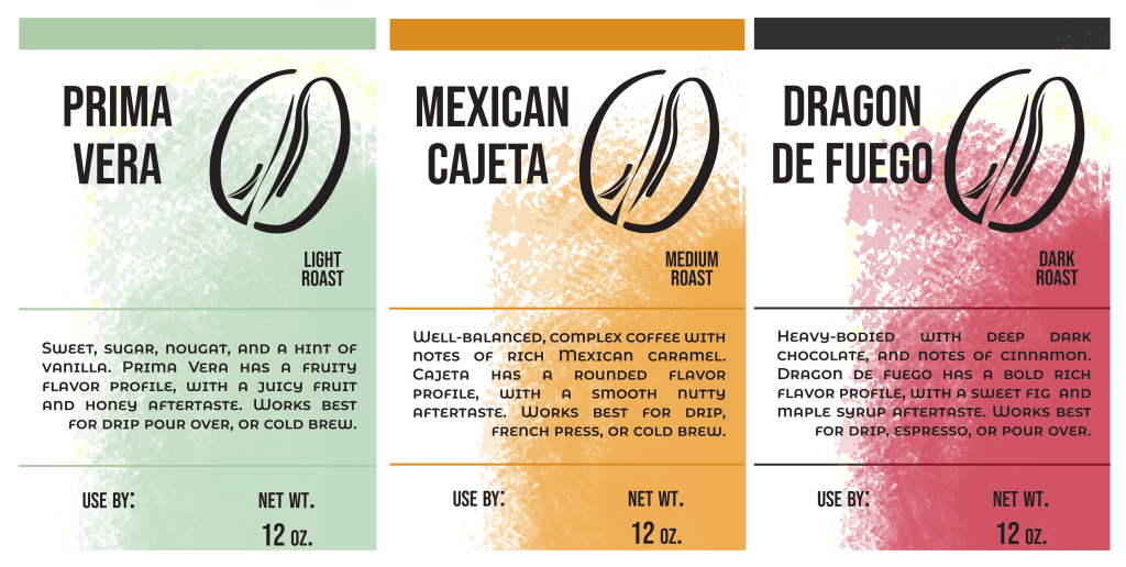
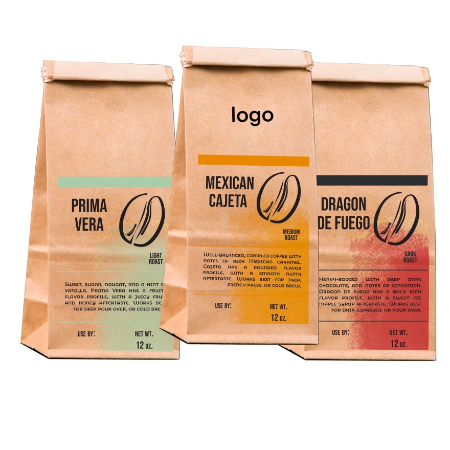
With the plethora of labels on the market, choosing a product labels was a bit overwhelming; however, two years ago we sold our coffee shop and I realized that there was a need for a clear label that could be put on a uniform craft bag.
Many small chain coffee shops stamp their own bags, and would be able to use a clear sticker, separate from the logo, that they could customize to the type of bean they are selling.
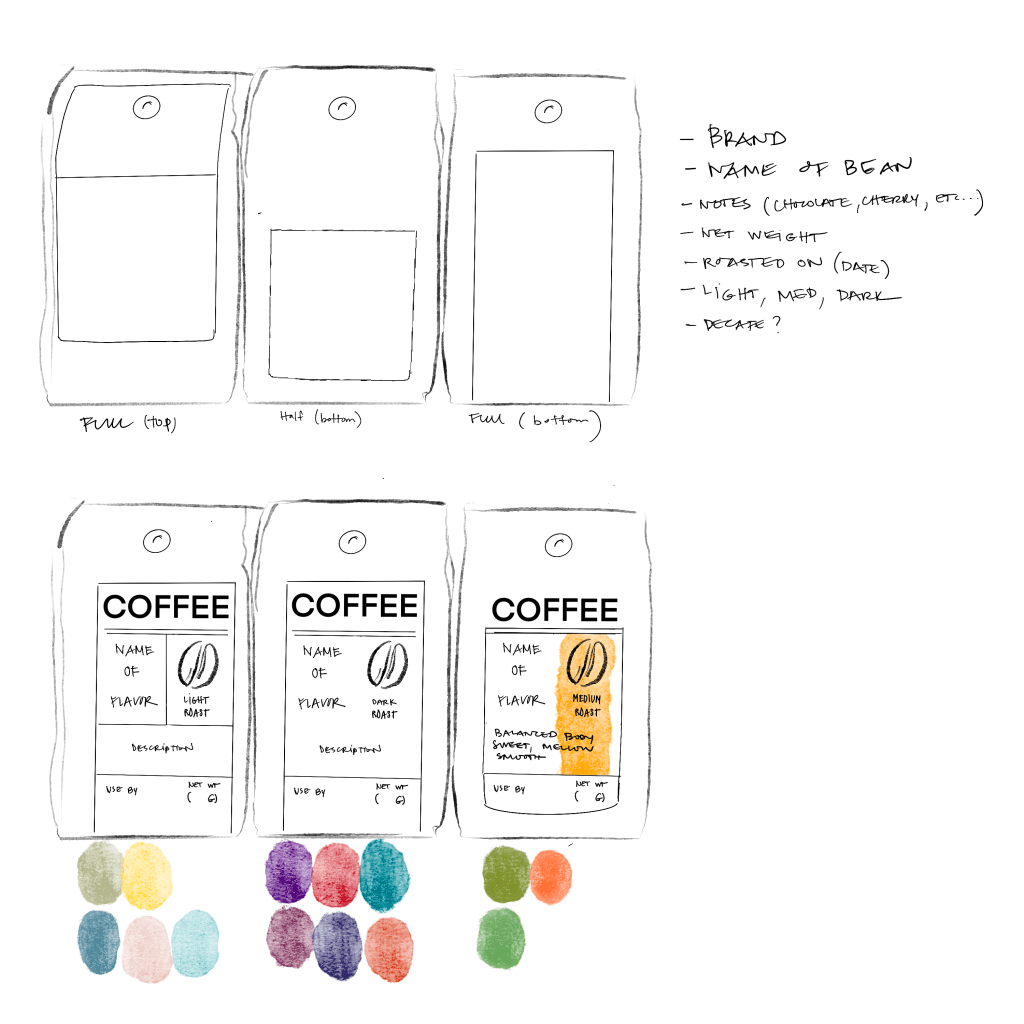

The process: The coffee bean was hand drawn in Procreate, then taken into Illustrator to be made into vector art. The label was then taken back into PS to add the final swatch of paint. In the future, when I am not under a deadline for a project, I would like to watch more videos on how to manipulate Illustrator art to look a little more painterly.
The goal of the labeling was to speak to the consumer about the nature of the product so they could began to differentiate before having to read the label.


Leave a Reply