
You can see yellow.
You can see blue.
You can see other colors, too.
Dr. Seuss.
Color surrounds us. It appeals, repels, and sometimes we are not conscious of it at all. Scientist, artist, and philosophers have all been intrigued by color. Since Sir Isaac Newton wrapped the visible spectrum in a circle, color has been expressed most frequently through the use of a color wheel.
The Color Wheel is divided into three sections: Primary, Secondary, and Tertiary colors.
Primary colors include: Red, Blue, & Yellow
Secondary colors are: Green, Purple, & Orange
Tertiary colors: blue-green, blue-violet, red-orange, red-violet, yellow-orange, and yellow-green.

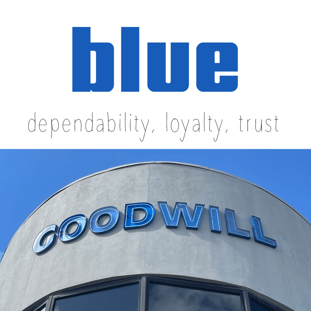
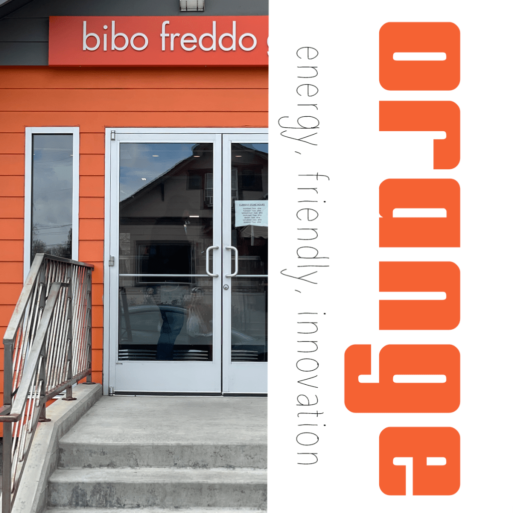
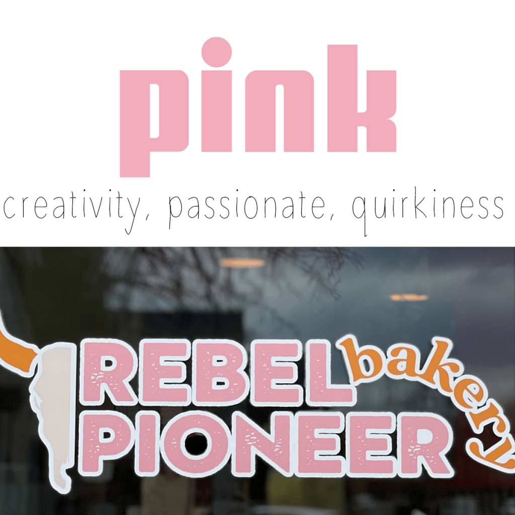
The psychology of color is big business. Think Coca Cola red, Visa blue, McDonald’s yellow, Starbucks green, Amazon orange, Barbie pink, FedEx purple, Nike black, and Apple white.
Although the ancients have investigated color as medicine as early as 2000 BC, and older scientific studies have made the connection between behavior and color, Healthline and Evidence Based Design note, it can be difficult to find current evidence-based research on the relationship between color and behavior. However, where psychology, psychiatry, and medicine seem curiously distant from the color/behavior relationship, marketing, advertising, and branding have taken the opposite approach. In fact, some say most of what we know about the connection between behavior and color are directly informed by, “marketing and sales analysis,” understandably, as businesses want to identify behavior that may positively or negatively effect their bottom line (https://www.online-psychology-degrees.org/study/color-psychology/).
Therefore, marketers, designers, and artist will continue to explore colors and their connections. On a Spring Break trip to Reno, I snapped a few photos of local businesses using color to attract. From coffee shops, retail stores, bakeries, wine bars, housing, hamburgers, restaurants, to gelato, color often matched the vibe the business was trying to project.


However, generalizations about color and the behaviors they invoke need to be approached with caution, as associations between behavior and color are complex, and also greatly dependent on culture and experiences.

Studying paintings is another way to explore color relationships.
From the subtly of Monet’s haystacks, to Van Gogh’s harmonious still lifes, to Picasso’s loud expressions of color, you can observe the principles of color relationships:
contrasting pairs
teams of four
contrast
balance
cool & warm combinations
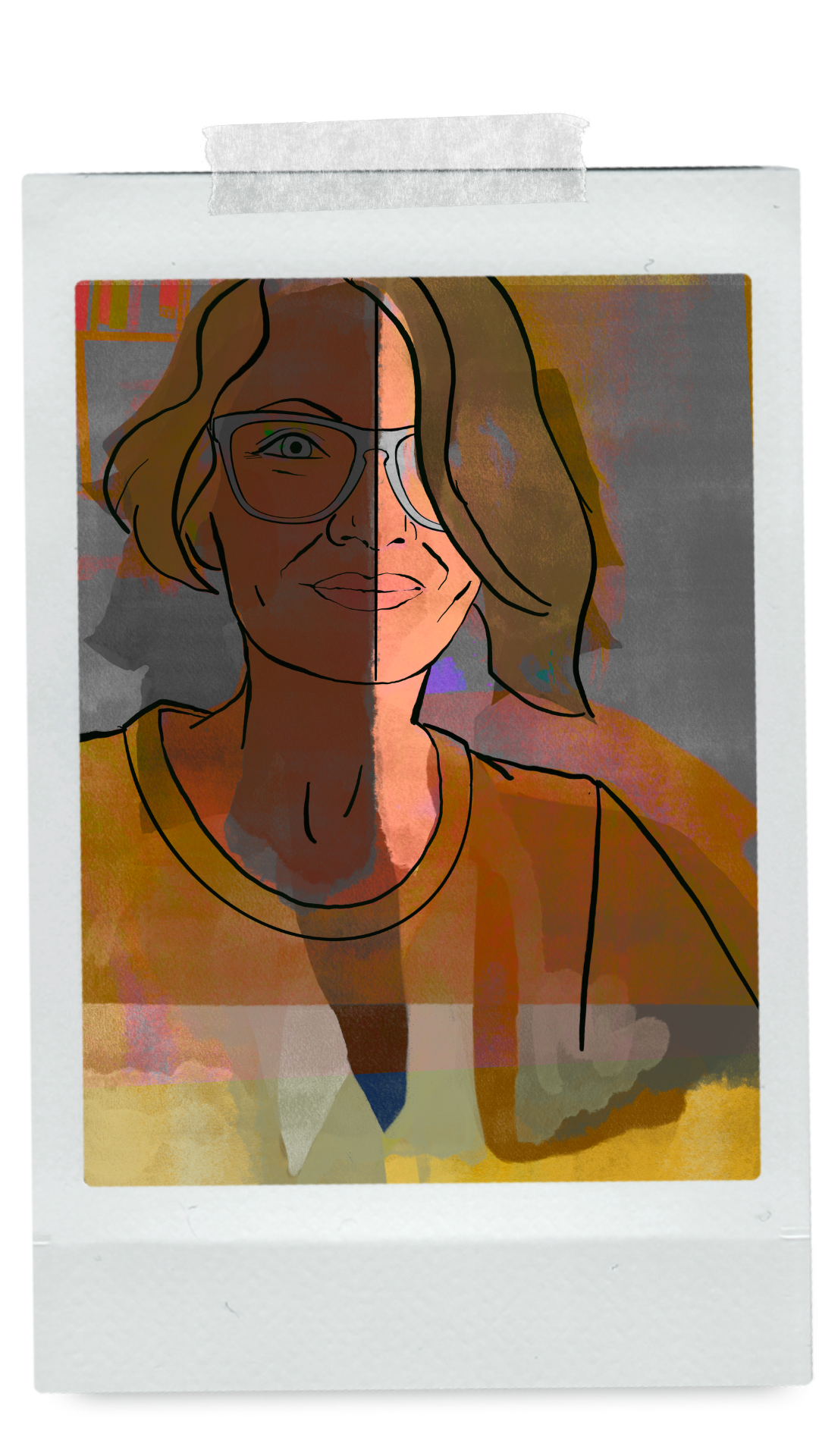
This was my first time using Adobe Illustrator, like all Adobe programs I found it complex, but intuitive. However, there is a wide gulf between creating raster graphics, and using a vector-based program. This became especially apparent when working out the soft nature of the mouth/lips in the selfie pose. However, despite the challenges, I enjoyed the process and after using Illustrator can see the need for both types of programs.

For the next exploration of color, I used and modified River City Theater Companies pre-existing logo (page 5), as well as, updated an old Pancake Breakfast flyer they had used in the past (page 6). Warm color combinations were used to convey warmth for the month, October, as well as, the comfort food of pancakes & maple syrup. The second color combination, used black for action, while red was meant to gain attention and possibly increase appetite, purple was added to the logo because of the assignment requirements. Finally, contrasting pairs were used to make an impact with blue and yellow, appropriate for the playfulness of the theater.

Leave a Reply