
Nouns are everyday utility words, we do things, with, at, on, and around nouns. Most of us can remember the old grade school adage, a noun is a, “person, place, or thing.” Who can blame us then, for thinking nouns are slightly boring, just a bit dry, I mean who wants a noun when a verb is around? However, Capitalize My Title reminds us that a noun can also be an idea or a state of being, and offers us some hilarious nouns that we can start using in our daily conversations, such as, dingus, scalawag, and taradiddle.
Although when it comes to typeface, silly nouns are not needed, as everyday nouns can be transformed by font. Sources estimate there are over half a million fonts in the world. Fonts can be classic, serious, dramatic, intense, or, casual, light airy, and fun. Font can invoke mood. In fact, 99Designs points out, font psychology is the, “visual and emotional reaction you have to the font you are seeing.”
The possibilities are endless.
However, what is not endless is the time we have to complete projects, and so it was in this case. The objective, choose 6 nouns, and use fonts that convey 3 different characteristics for each.
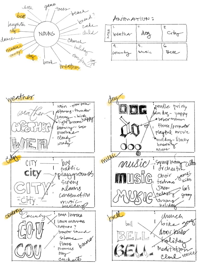
Notice brainstorming created another flurry of creative ideas, and the decision to animate the project was made. However, animation adds another layer of complexity as not only must the nouns be given a mood by their specific font, but also by sound and movement (animation). Sometimes constrictions are helpful to ensure that a project gets done, so in this case, black and white fonts, without embellishments or color, were used. Free fonts were selected from dafont.com, and choices were made within the first 3 pages or so. The sheer amount of fonts can be quite overwhelming, however, dafont is helpful in that you can pick a style and then type the word you would like to see in that font.

Sourcing free sounds was the next step. Enter, Orange Free Sounds, where sounds are neatly organized by category. Again, limiting yourself to choosing a sound within the first 3 pages protects you from endlessly searching for that “perfect” sound, cutting into your precious animation time.

Next, animation. This includes storyboarding, loading sounds into After Effects (AE), adding in the appropriate text and font for each noun. Then comes the rigor of animation. I use the word rigor here, because while animation is fun, every visual second watched, requires loads of detailed work behind the scenes. For example, in this video 1:30 worth of animation required 99+ layers and countless manipulations. This may be especially true when you are new to animation.

As a third restriction, animation techniques were used based on learning from School of Motion’s, After Effects Kickstart, which means no simply slapping on a text “effect,” and instead creating mood by thoughtful manipulation of the five properties used to create key frame animation (this ended up working for all 18 nouns, with one exception).
Finally, the project is, “finished.” As, with all digital projects the temptation to, “undo,” is persistent. The minute you finish, you realize that you could continue to make several more tweaks, and adjustments, making it that much better. However, this can be a slippery slope, leading to good intentions and many unfinished projects. If you can relate to this struggle, you may enjoy reading this excellent piece written by Ransom Patterson, Struggling to Finish a Project? Try These 7 Techniques.
The next Typography assignment started as an 11×17 white Photoshop (PS) document…the blank white canvas stares back at you threateningly. What is it about a blank white canvas that can be so intimidating? How do you approach it as a designer, and less as an artist? In, The truth about Art vs. Design, Benek Lisefski said, “Art, in its purest form, has no boundaries or intent….Design doesn’t have this luxury. Design always has a specific purpose. It must achieve a goal, and if it doesn’t, it’s judged to be bad design.” Others would simplify it further by describing fine art as, “design’s, ’emotional counterpart’.”

Design functions within a space. It has utility. Purpose. Rules. It requires observation. Information. Users. Humility.
Design is a skill.
Lisefski’s recommends bridging the gap from artist to designer, by embracing objectivity and thriving within constraints. Austin Knight states simply, “ego has no place in design.”
Designers must be ready to LEARN.
As an artist, you may not want to look at other people’s work, as a designer, you must. Every assignment solidifies the fact, I have a lot to learn.

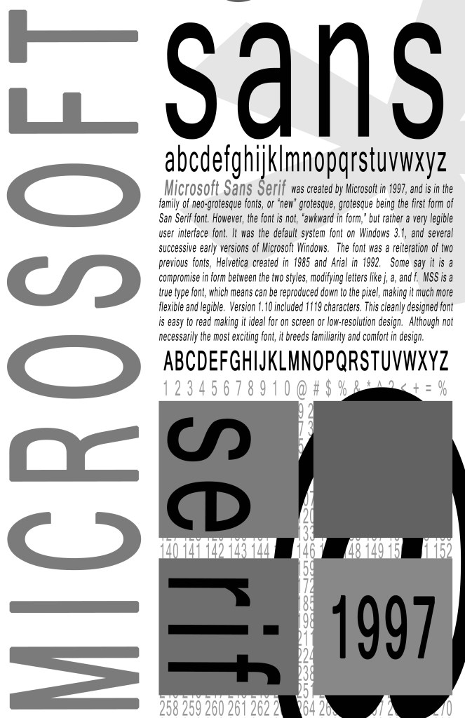
Grayscale:
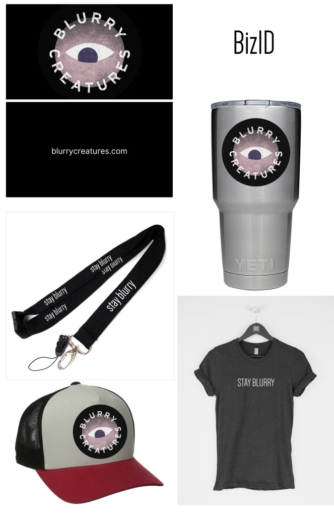
Blurry Creatures podcast already boast a pretty fabulous logo, and sells various bizid on their website, however, my goal was to create promotional merchandise to match their great vibe. The font Dense, is a clean sans serif, used to complement their modern take on 80’s style, as well as, to create a juxtaposition between the words blurry and clear. The word blurry means, “not clearly or distinctly visible or audible,” by using a very clean font, the design challenges assumptions, maybe what is blurry is actually clear? Mixing and matching their logo with one of their famous taglines, creates merch that is meant to start conversations, which is part of what Blurry Creature’s brand is all about.

Leave a Reply